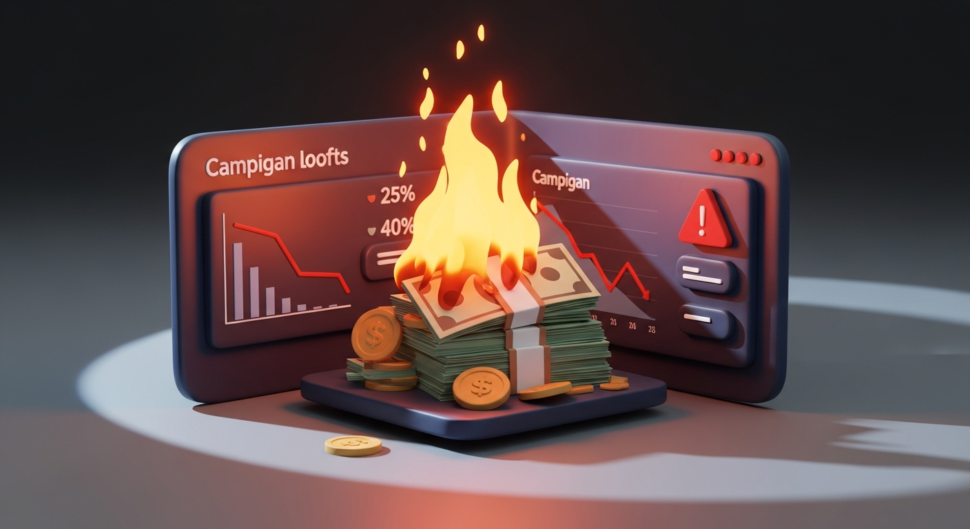
Your homepage gets 10K visitors a month. 150 sign up. That's 1.5%.
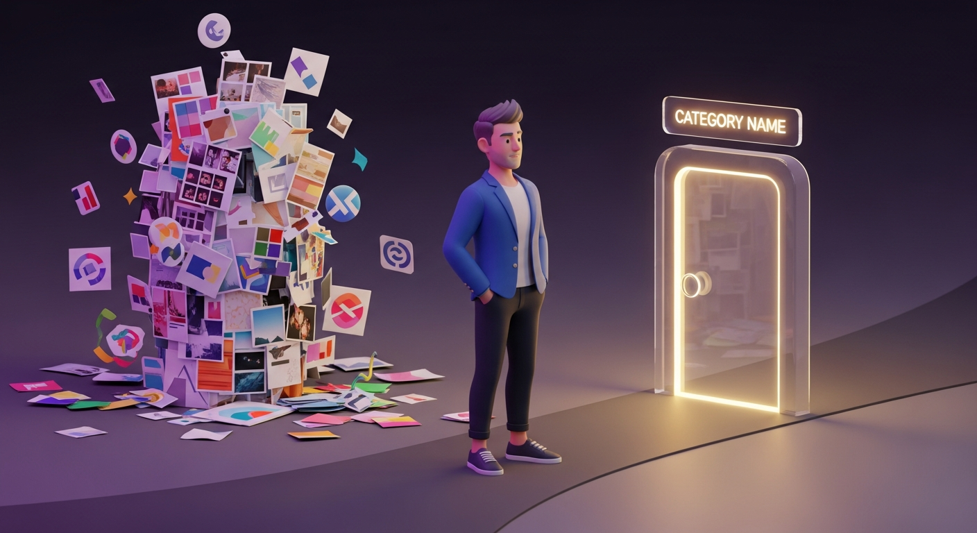
You hire a CRO agency. They test button colors. They try "Start Free Trial" vs "Get Started."
Conversion goes to 1.6%. You spent $8K.
Here's the problem: You optimized the wrong thing.
Why most CRO fails
Most Conversion Rate Optimization (CRO) is surface-level.
It’s button color tests, headline A/B tests, and minor CTA copy variations.
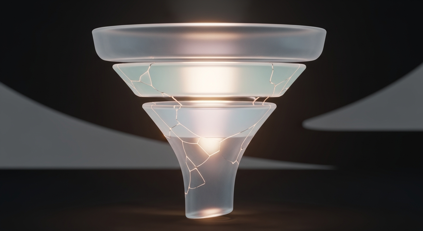
This works if your funnel is fundamentally sound. But if people don't understand what you do, don't trust you, or don't see proof, a blue button won't save you.
Real CRO starts with diagnosis, not execution.
Think about the typical broken funnel. Traffic arrives from paid ads, organic search, or referrals. They land on a homepage that's vague: "The all-in-one platform for teams."
There's no proof. No logos, no testimonials, no case studies.
The CTA is a generic "Book a demo."
They leave.
The agency tests the CTA button color. Conversion stays flat. Why? Because the real issues are clarity and trust.
The CRO stack most teams ignore
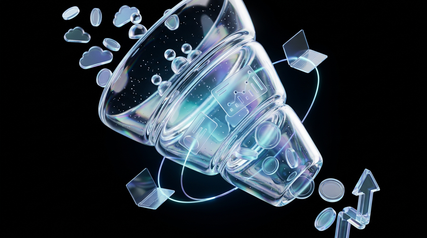
To actually fix your funnel, you need to look deeper. The real conversion path has five layers.
The 5-Layer CRO Stack
1. Clarity: Do visitors understand what you do in 5 seconds?
2. Relevance: Does your page match the intent of the traffic source?
3. Proof: Do visitors trust you enough to take the next step?
4. Friction: How hard is it to convert?
5. The Offer: Is what you're asking for appropriate for the visitor?
Layer 1: ClarityTest this now: Show your homepage to someone outside your company. Ask them to explain what you do. If they can't, your messaging is broken.
Layer 2: RelevanceIf someone clicks a Google ad for "B2B payment automation" and lands on a generic homepage, they bounce. The landing page needs to echo the ad's promise.
Layer 3: ProofB2B buyers don't convert on aesthetics. They convert on proof.
- Logos (Social proof: "Companies like mine use this")
- Case studies (Outcome proof: "This actually works")
- Testimonials (Emotional proof: "People like me had a good experience")
If you have traffic but no proof, your conversion will stay under 2% no matter how many buttons you test.
Layer 4: FrictionHow hard is it to convert? Count the steps. If it's more than two clicks from landing to conversion, you're losing people.
- Bad: Homepage → Features page → Pricing page → Sign-up form (4 steps)
- Good: Homepage → Sign-up form (1 step)
Layer 5: The OfferWhat are you asking them to do? "Book a demo" is a high-friction ask for early-stage buyers. "Start free trial" is lower friction. "See how it works" (with a video or interactive demo) is often the lowest friction. Match the offer to the buyer's stage of awareness.
The diagnostic framework
Here's how we actually fix funnels. It's a system, not a series of guesses.
Step 1: Map the full journeyWhere does traffic come from (Google Ads, Organic, LinkedIn)? Where do they land? What do they do next? Use GA4 or Hotjar to watch session recordings. See where people drop off.
Step 2: Identify the highest-impact pageWhich page gets the most traffic but converts the worst? It's usually the homepage, pricing page, or a generic product page. Fix the highest-traffic, lowest-converting page first.
Step 3: Run the clarity testShow that page to 5 people outside your company. Ask: What does this company do? Who is it for? What happens if I click the button? If they can't answer in 5 seconds, rewrite your headline and subheadline.
Step 4: Add proof above the foldAdd a logo bar, a powerful testimonial, or a key stat. Something like "Trusted by 500+ B2B companies" with a logo bar can lift conversion by 15-30% on its own.
Step 5: Build a test clusterDon't test one thing at a time. Test a hypothesis. For a pricing page, the hypothesis might be: "Visitors don't trust us enough to buy." The test cluster would be:
- Test 1: Add testimonials above the pricing table.
- Test 2: Add a "30-day money-back guarantee."
- Test 3: Add a case study link next to each plan.
Run all three as a package. Measure the lift.
Real example: What we did for a client
We worked with a B2B SaaS client who had 8,000 visitors/month to their homepage but only a 1.2% conversion rate to demo requests.
The Diagnosis:
- The homepage headline was vague: "The platform for modern teams."
- There were no logos or customer proof.
- The CTA was "Request a demo," a high-friction ask for cold traffic.
The Fix:
- We rewrote the headline to be specific: "Turn website visitors into qualified pipeline with automated lead scoring."
- We added a logo bar: "Trusted by 200+ B2B companies."
- We changed the CTA to "See how it works," linking to a 2-minute demo video.
- We added one testimonial with a specific outcome: "We increased our demo-to-close rate by 40%."
- The Result:The conversion rate went from 1.2% to 2.8% in 30 days. Same traffic. Same product. Different page. The cost to implement was $0.RWhen to actually A/B test
You should A/B test after you've fixed the fundamentals.
Test when:
- Clarity is high (people understand what you do).
- Proof is present (logos, testimonials, case studies).
- Friction is low (1-2 clicks to convert).
Then, you can test headline variations, CTA copy, proof placement, and form length. But if your baseline conversion is under 1.5%, testing is premature. Fix the fundamentals first.
Stop guessing. Start diagnosing.
Most teams waste months testing button colors when the real problem is messaging, proof, or friction.
Fix clarity first. Add proof second. Reduce friction third. Then, and only then, start testing.
We've rebuilt conversion funnels for B2B SaaS companies doing $2M-$50M ARR. The pattern is always the same: surface-level tests don't work. Systematic diagnosis does.
If your conversion rate is stuck under 2% and you've tried 'CRO' before, the problem isn't your buttons. It's your system.
Want us to audit your funnel? We'll show you exactly what's broken and how to fix it.


.png)
.png)
.png)
.png)
.png)
.png)
.png)
.png)
.png)
.png)